

People don’t quite
get what we do.
Help the right customers understand your business, without making them work for it.
Make the introduction countGood business. Better website.
Your business has a lot going for it — but does your website tell the right story?
DigiThat reviews and refreshes existing websites to help your customers quickly understand what you do, find what they’re looking for, and take the next step.
Because a good website shouldn’t just look good — it should make it easier for people to do business with you.
Help the right customers understand your business, without making them work for it.
Make the introduction countGive your business a website that reflects the care and quality you put into your work.
Put the proof to workMake the next step clear, whether that’s an enquiry, a booking or a conversation.
Explore your starting pointYour website should make someone feel, “These are my kind of people”—and make it beautifully obvious what to do next.
See the difference
A makeover goes beyond appearance. Explore how clear information, useful functionality, mobile usability and thoughtful next steps help customers choose, enquire or book. Open the examples to try the journeys as well as comparing the designs.
Desktop screenshots · 1440 pixels wide
The original introduces the setting and offers a straightforward viewing enquiry.
The makeover helps couples compare spaces, explore guest needs and put together a more useful viewing request.
Focused cellar-door exampleCopperleaf Vineyard keeps the focus on tastings, visiting and exploring the vineyard. The Barossa winery example below shows a broader estate website.
The original gives the vineyard a recognisable identity and introduces the visit.
The makeover makes visit options, wines and practical planning easier to find, with clearer next steps for different visitors.
Full estate experienceWattle & Stone brings wine shopping, dining, stays and weddings together, with more visual exploration. It is a different fictional business from Copperleaf, showing a broader scope.
The original presents the estate and its range of experiences in a familiar brochure format.
The makeover separates competing visitor needs into tasting, wine, event and stay journeys, with useful detail before an enquiry.
The original explains the type of work and provides a direct project enquiry.
The makeover helps visitors find relevant project types, understand the process and send a better prepared brief.
Classic salon makeoverMaison Muse presents the salon, services and team in a familiar page layout. For a more guided visual approach, choose the Hair atelier example.
The original has its own salon identity, a clear service list and an appointment enquiry.
The makeover helps visitors understand service options and what to expect before choosing their next appointment step.
More visual, guided makeoverMaison Élise uses visual storytelling and guided starting points to help visitors explore services. It is a different fictional salon, showing another design direction.
The original presents a credible salon, its services and a simple way to get in touch.
The makeover adds service guidance, stylist discovery and a more structured appointment journey, reducing the questions visitors have to work out alone.
The original shows the work clearly and describes the core offer.
The makeover connects project inspiration with practical planning, helping visitors explain their room, priorities and requirements.
The original communicates the trade clearly and provides a usable enquiry form.
The makeover helps customers match a problem to a service, check service areas and prepare a useful visit request.
The original communicates the atmosphere and offers a straightforward stay enquiry.
The makeover brings cabin choices and planning details closer to the booking decision, helping guests make a more informed enquiry.
The earlier concept introduces the garden-care services and offers a simple enquiry form.
Clear service choices and a three-step planner help visitors describe their garden and the help they need. Try the planner and download a starting brief.
Fictional businesses and illustrative designs. Each “before” is a believable earlier website concept, not a real client’s former site. The comparisons show design and customer-experience ideas; they do not claim measured increases in enquiries, bookings or sales.
Your customers’ next steps
Follow a customer from their first question to their next step. These fictional stories show how a clearer website can help along the way.
Different business? These examples are a starting point. Your website will be shaped around your customers.
This scene’s artwork is not ready yet.
The story is available below. This preview is still in progress.The venue owner meets the couple at a wedding exhibition. They go home keen to explore the venue online.
Fictional concept. Ideas to explore, not templates to choose. Your website is shaped around your business.
You don’t need a finished brief. Tell us what your business does and what you’d like your website to do better. We can work out the next step together.
You should know what we’re doing, why it matters and what happens next. Suspense is excellent television. Less excellent project management.
We look at what your customers need and where your current website makes things harder.
You get a clear scope, price and design direction before the build. No mysterious extras wandering into the room.
Review the pages, test the important customer actions and launch with an agreed handover and a recovery plan.

Business Growth · Client Partnerships
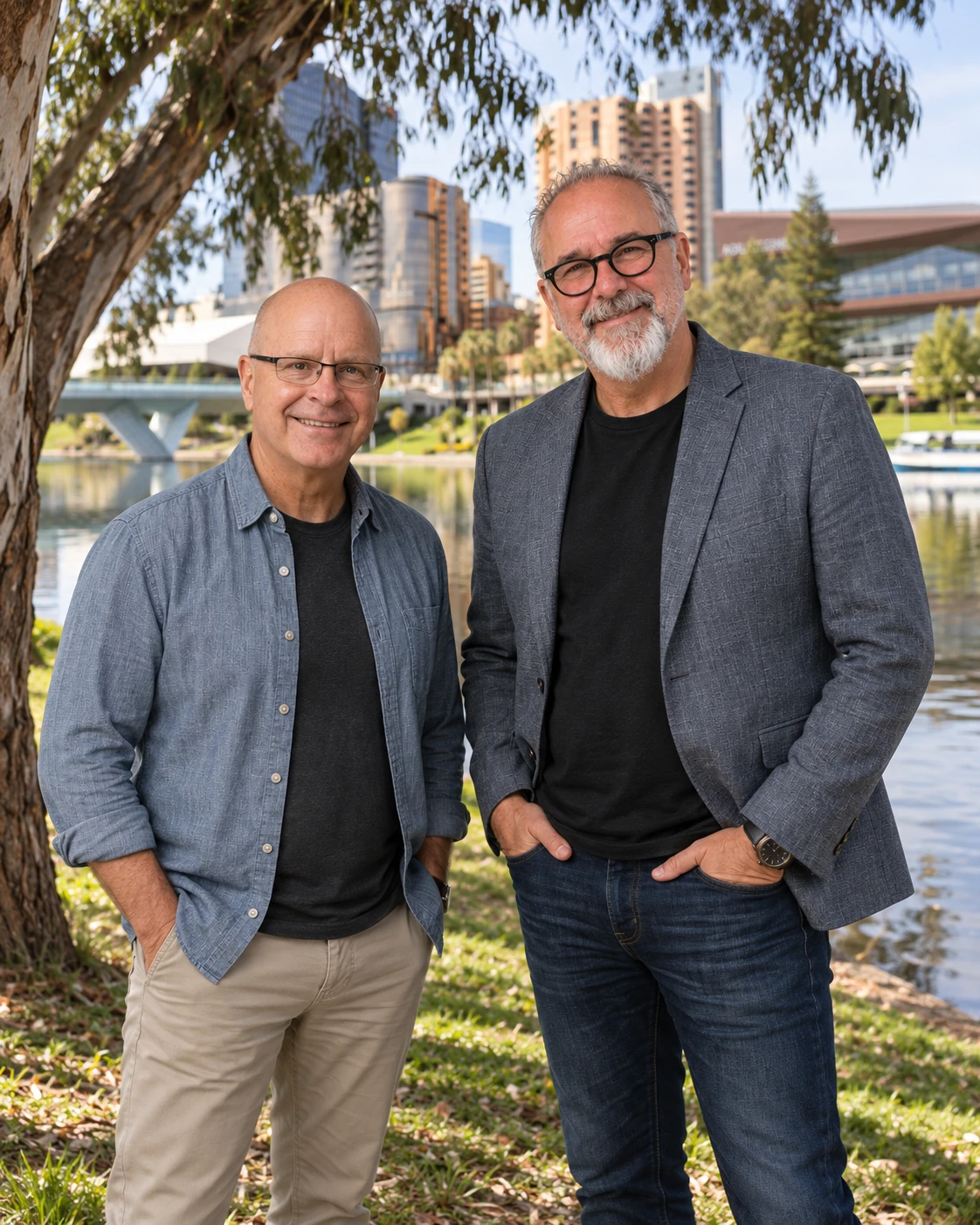
Greg helps make the DigiThat experience clear, thoughtful and easy to navigate. With more than 30 years of experience across sales, marketing, design, business development and partnerships, he brings a commercially minded, people-focused approach to every conversation.
He has worked with businesses, destinations and communities to strengthen brands, improve customer experiences and support sustainable growth. At DigiThat, Greg helps clients feel understood, guided and confident as their website makeover takes shape.

I’m Robin Custance: an Adelaide-based artist with a love of thoughtful design, useful websites and conversations that sound like actual people.
Tell us about your business, what you’re proud of and what your website isn’t saying. The holiday story is welcome too. It may even be the more interesting bit.
Not automatically. We first look at what works, what is hard to change and what your customers need. The agreed scope might be a focused refresh or a fuller rebuild.
That depends on the pages, content, platform and integrations involved. We agree a written scope and price before build work begins. The first conversation is about finding the right job, not selling the biggest one.
Mobile layouts get their own review: navigation, readable content, the example showcase and the enquiry journey. They are not simply desktop pages reduced to postage-stamp proportions.
No. These are fictional design examples, not client testimonials, measured results or booking promises. They show how clearer information and thoughtful design can help a customer decide.
A makeover can make it easier for customers to understand your offer and get in touch, but it cannot guarantee more enquiries. Your offer, audience, traffic and follow-up matter too. We agree what to improve and how to assess the result.
No. You need clear decisions, not an honorary computer science degree. I’ll explain the options in ordinary language.
A free playbook. A useful plan.
A practical review for business owners who know their business deserves a clearer website. Find the friction, keep what works and choose the next worthwhile change.
Read online, download the PDF or complete the working pages. Get a one-off email link to the playbook; follow-up emails are optional.
Tell me what you do, what feels wrong and what a better website would help you achieve. We can start there.